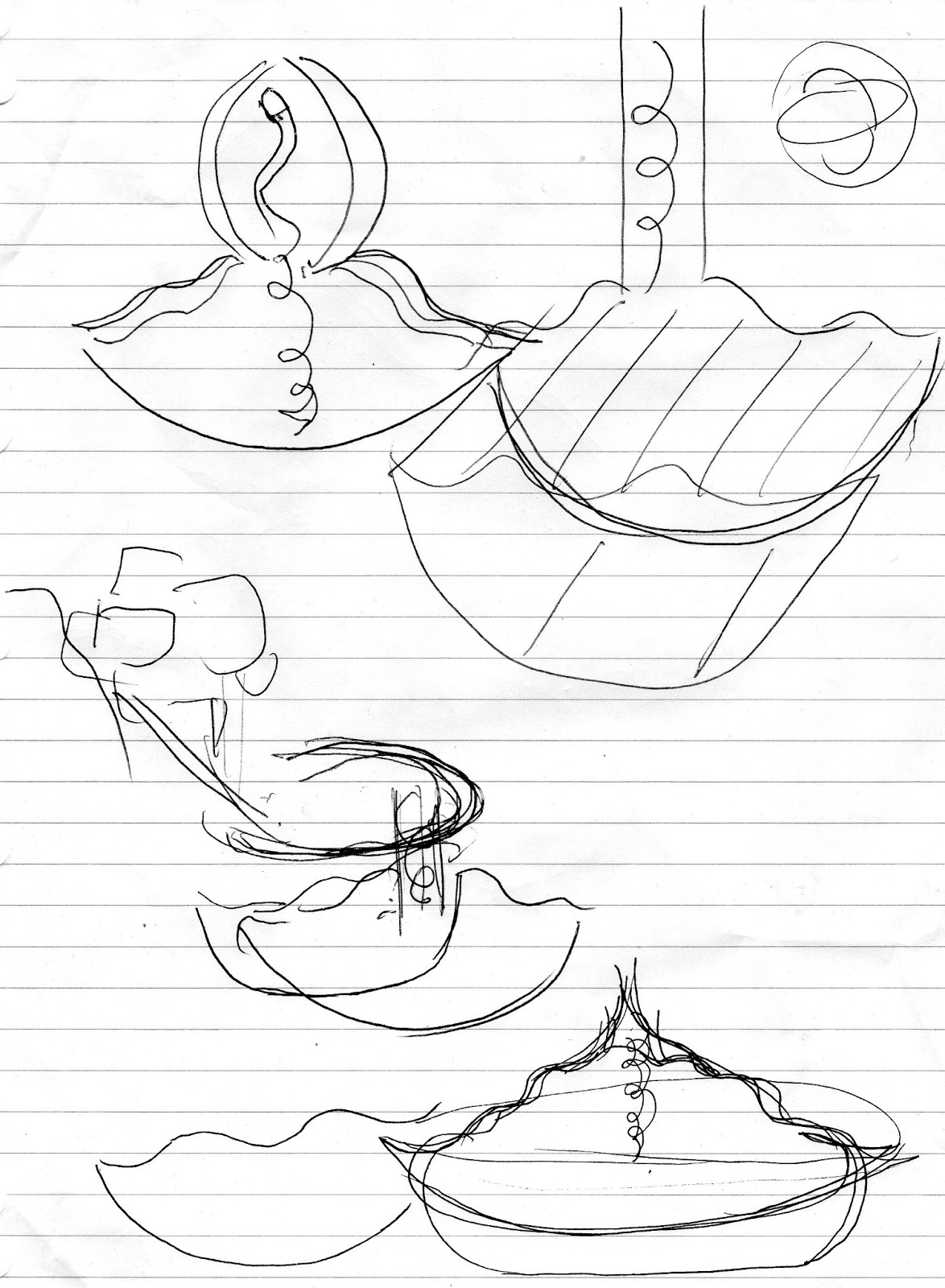
I haven't made a blog post in a while so here is an update on all the fun and exciting things that have happened since the last class. Jacky's feedback for my last draft model (see last post) for the above ground was basically that it needs to be further 3D'd/3-dimensionalised (if that is a word). More push and pulling of the spaces, less static. Here's the sketch Jacky drew. He also referred me to the works of Dutch architectural group, MVRDV.
Wozoko Housing, Amsterdam, 1994-1997 (http://spatialinteractions.wordpress.com/category/interactions/page/10/)
Vertical village, (http://inhabitat.com/mvrdvs-vertical-village-exhibition-explores-alternative-urban-densification-in-east-asia/)
DNB Bank Headquarters, Oslo, Norway, 2012 (http://www.archdaily.com/307256/dnb-bank-headquarters-mvrdv/)
The Transit Lager, Muchenstein (http://afasiaarq.blogspot.com/2012/03/mvrdv_29.html)
My below ground didn't really get much feedback because it wasn't really done, but I wasn't happy with it anyway, it was just a rushed kind of half-hearted attempt at making a curvy shape into a space. Anyway I'll get to what I ended up developing for the below ground a bit later. So. Here is my model.
Above:
With Jacky's advice and a bit of research into MVRDV, I tried to make the above ground more 'stacked', more 3D with more angled blocks. The studio is made of smooth timber, creating a warm but strong exterior. Also kind of evocative of the woodiness of a violin body and Baroque charm. There are also many glass windows which I've used to try to convey a certain fragility. I feel like Stradivari's work is warm and powerful like the timber, but its also fragile, and obviously treasured and highly valued (I did some research- one of his violins was auctioned for $2.03 mil..?! Some people really like violins). I also wanted lots of windows so that the interior space would be flooded with ample natural light, to create an open environment, and also to allow the music to resonate nicely. Although an exterior view would suggest otherwise, it is just one floor, so there is a high, shapely interior ceiling.
The word from the original section was 'rhythmic', and I've tried to capture this with the box-like shapes, regularly repeating, and like rhythm, not always consistent in size, but still rhythmic in the sense that it is consistently returning. The many rectangular glass windows also contribute to this constant rhythm of shape.
The texture titled 'springy' adorns the crescendo-/musical staff lines-/violin string- inspired stair, and the 'elastic' texture is placed in the little interior spaces of the studio - these spaces can be used for storage, placement/display, benchtops to work on, or just seats to sit down and look out the windows. These spaces are versatile and inspiring, as they lead to the main windows on the inside, hence I've used the 'elastic' texture.
Showroom:
My main aim with the showroom was that I wanted it to be relatively open, because the purpose of the showroom is to showcase the artists' work, so an amphitheatre kind of glass pyramid structure is used. The colour green I feel is very lively and creative, I wanted that feeling to be there too, via the roof/ceiling beams. The 'springy' texture is also used on the walls to give an energy.
Below:
So with my below ground studio I basically started again because I hadn't yet really thought it out properly before. I thought back to my original section word - 'flavour', and also about Jiro Ono and did some more research on his background (a quick little 'did you know': you need to book a year in advance for a reservation at his sushi restaurant, yikes). The feedback I got from Jacky was mainly that I need to focus more so on the interior experience, because obviously you can't appreciate the exterior shapes and surfaces of a below ground studio. I decided to focus on a waved ceiling and floor, the gentle slopes evoking an exciting 'flavour'.
The spiral staircase steps features the 'dynamic' texture as it leads to a fast-paced and intense work space. It also is adorned with a soft, fleshy red (like raw salmon!!!). This red, combined with the shades of black/white/grey of the rest of the interior highlight a subtle traditional Japanese influence.
When viewed from above, you can see the stair is oval shaped - these curved shapes reminiscent of sushi rolls. The interior walls and ground are made of metal tiles, maybe stainless steel, to give Jiro an immaculate environment to create his sushi in. I feel the clean, shiny facade of steel also gives off a feeling of meticulous perfectionism, which Jiro embodies. The two flat walls have the 'dynamic' texture on to highlight the space, and is also on the horizontal strip to give it some depth.
Also: my friend showed me how to render Sketchup files to make my model look 'pretty', so I tried it out! It does look kind of swish. It makes my design look far prettier than it truly is. How sneaky.
Okay time to work on animations - yay. This has been a post.